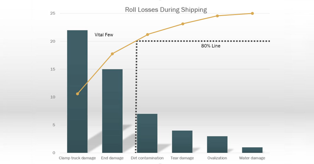
- Pareto charts are a simple yet effective tool for identifying root causes, adhering to the principle that 80% of issues stem from 20% of causes.
- Creating a Pareto chart involves data collection, categorization, ordering by frequency, graphing, and analyzing to identify key problem areas.
- Pareto charts are widely valued for their clarity, making them a powerful tool for presenting findings and driving actionable solutions.
Pareto charts are a practical tool for analyzing root causes in business processes, based on the 80/20 principle, which states that 80% of problems often arise from 20% of causes. This makes them particularly effective for prioritizing issues and focusing on the most impactful solutions. Their simplicity and flexibility make them a go-to tool for Lean Six Sigma practices and quality control.
Creating a Pareto chart involves gathering relevant data about process failures, tallying occurrences, and categorizing them by frequency. Data is then ordered in descending importance and displayed in a bar graph, often accompanied by a cumulative line highlighting the most significant contributors. The resulting chart allows users to pinpoint the root causes responsible for most issues, enabling targeted remediation.
Pareto charts are especially useful for presenting findings to stakeholders, as they are easy to understand and provide actionable insights without requiring in-depth statistical expertise. Their effectiveness lies in their ability to distill complex data into a clear, visual format, making them a valuable first step in problem-solving and process improvement. Pareto charts are a cornerstone of efficient root cause analysis and quality management when combined with other analytical tools.


Leave a Reply
You must be logged in to post a comment.