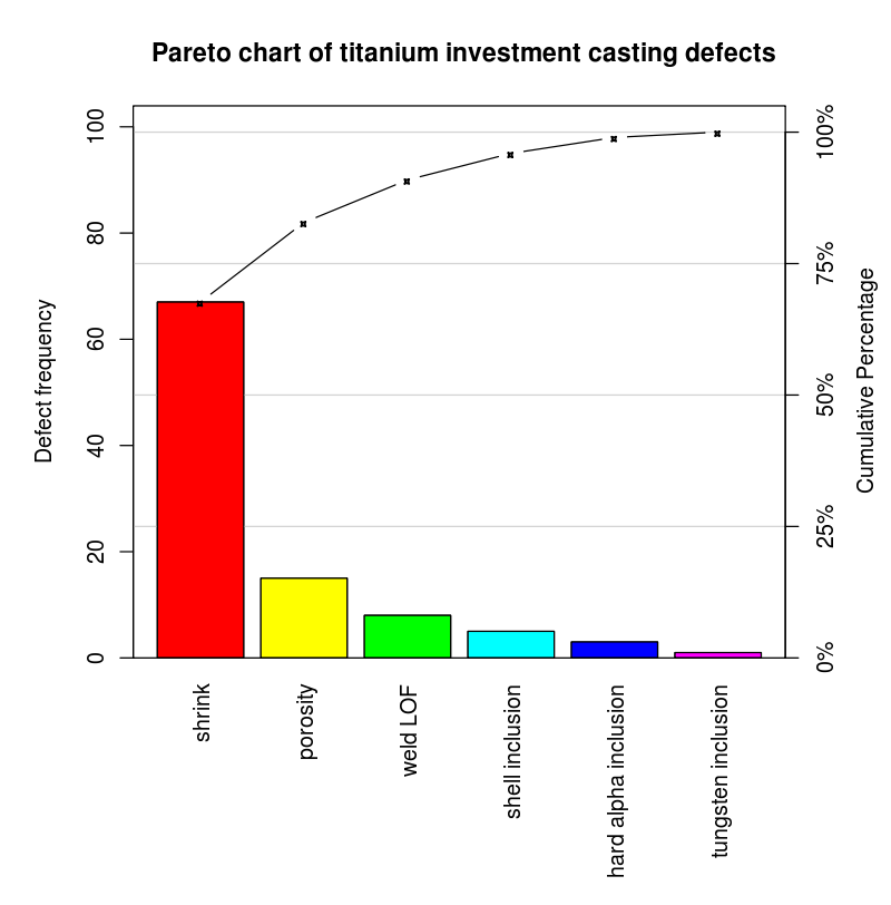
The Pareto Chart is a bar graph tool for prioritizing issues based on their frequency or impact. Invented by Vilfredo Pareto, it is combined with a line graph representing the cumulative total. The Pareto Principle, or the 80/20 rule, states that roughly 80% of effects come from 20% of causes. Dr. Joseph M. Juran popularized the Pareto chart in quality management, emphasizing the focus on the “vital few” problems rather than the “trivial many.”
The Pareto Chart is essential in Six Sigma and Lean Manufacturing methodologies. It helps businesses prioritize efforts and allocate resources effectively. It is used for defect analysis, customer complaint analysis, and identifying areas for improvement. The key elements of the chart include bars representing frequency, a cumulative line graph, primary and secondary axes, and issue categories.
Creating a Pareto Chart involves six steps: identifying and defining the problem, data collection, sorting the data, calculating cumulative data, constructing the graph, and analyzing the chart to prepare an action plan. The chart helps distinguish between the most significant and less critical issues, guiding businesses to focus on high-impact problems.
While the Pareto Chart has limitations, such as not identifying root causes or showing trends, its benefits include improved decision-making, increased efficiency, and productivity. It is a powerful tool for prioritization and continuous improvement across various sectors and departments, promoting a data-driven decision-making culture.
In conclusion, the Pareto Chart is an essential tool in quality management and problem-solving. It enables businesses to optimize resources, improve efficiency, and prioritize actions effectively.


Leave a Reply
You must be logged in to post a comment.